
May 13, 2026Inspiration
Color Palettes for Handmade Paper Suites

Overview
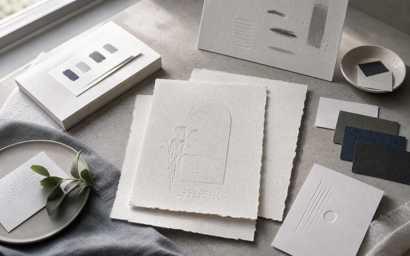
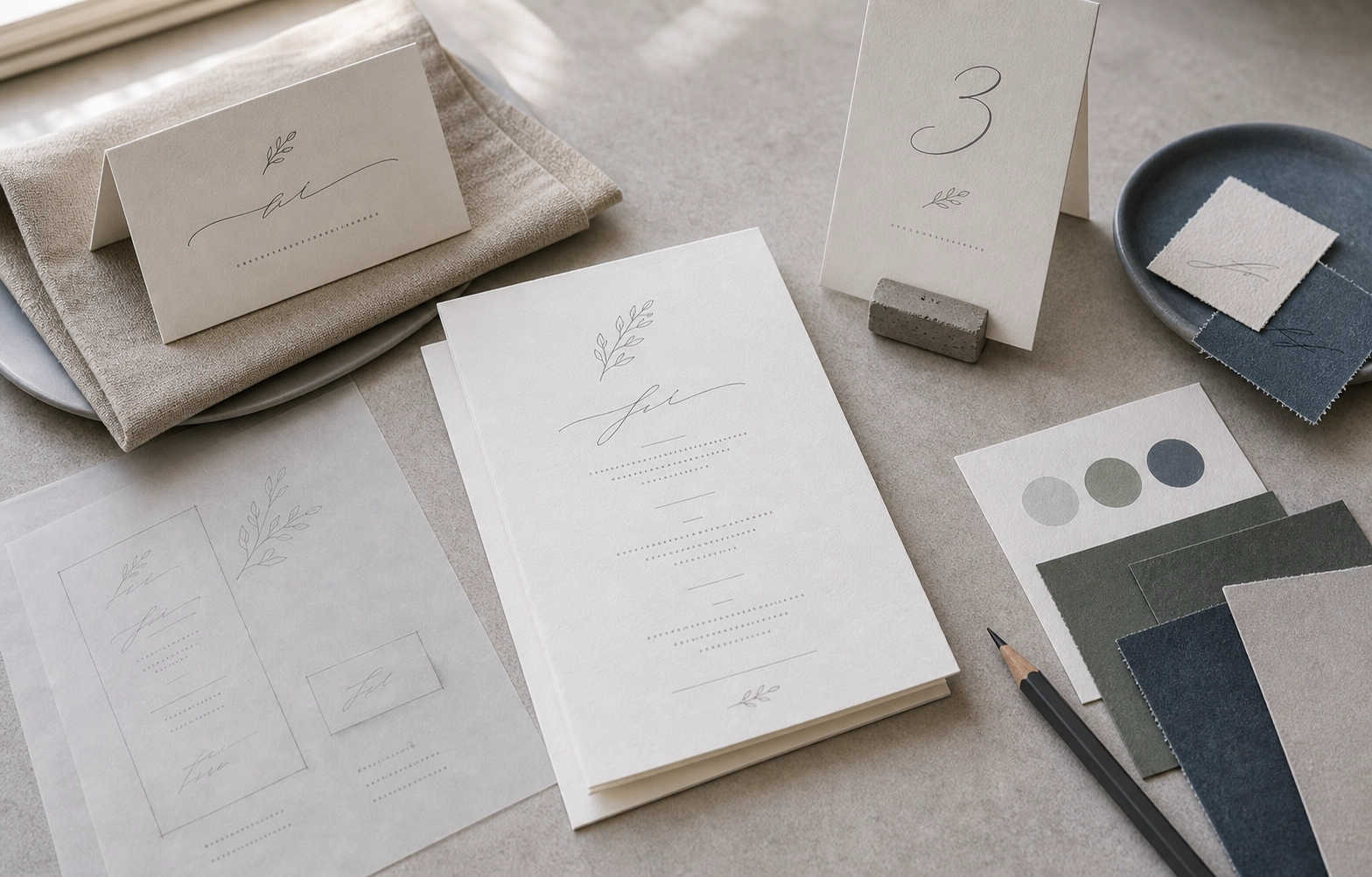
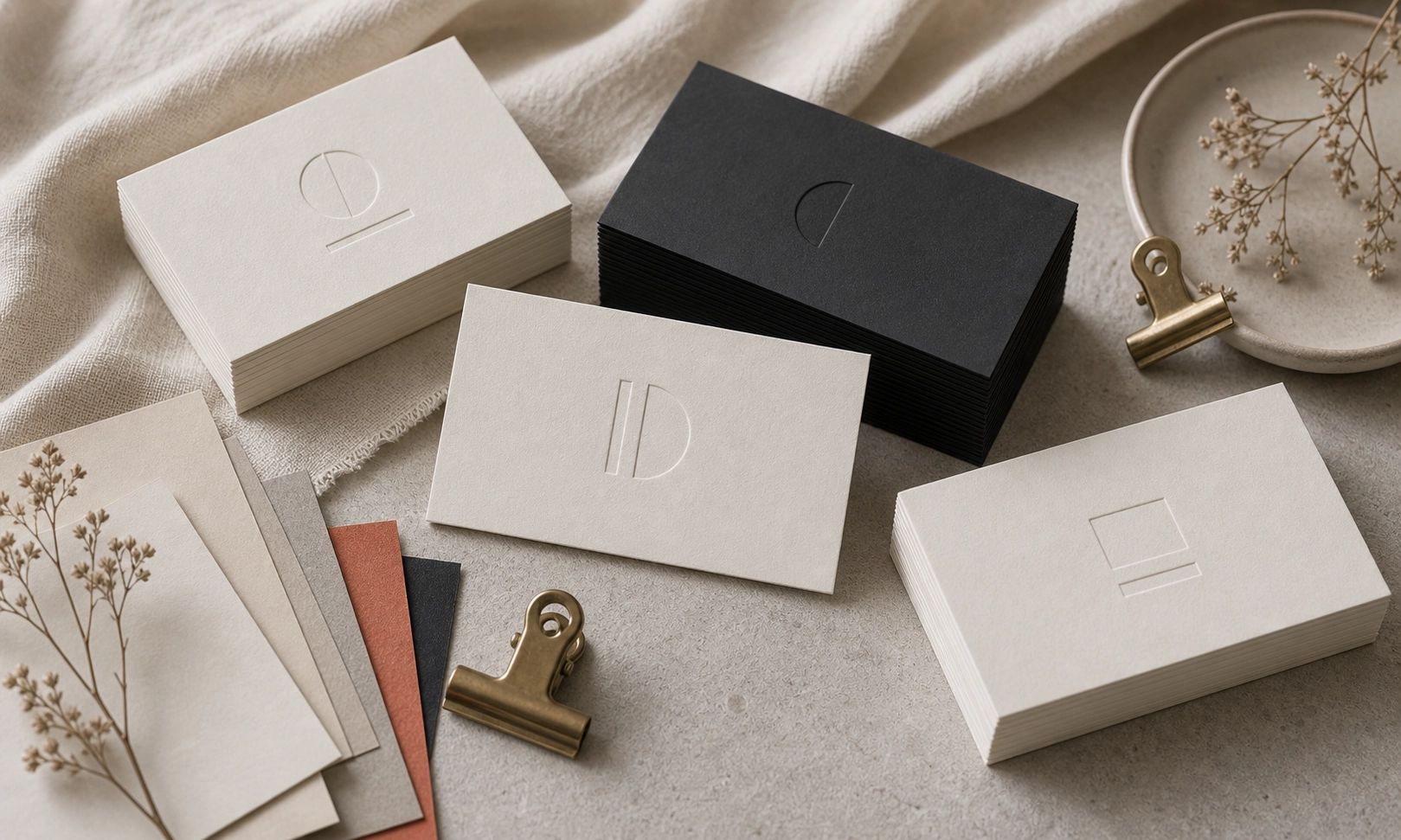
Handmade paper already brings variation, so the palette should support the fiber texture instead of fighting it. Palette directions that pair well with textured handmade paper, from warm neutrals to muted garden tones.
Production Notes
The direction was planned around handmade-paper, color, wedding-stationery. We kept the layout practical for production: files stay clean, finish layers are separated, and the visible hierarchy remains calm at real print size.
Details
- warm neutral base
- soft accent ink
- envelope contrast
Takeaway
This piece is a useful reference for customers comparing paper, finish, and layout decisions. It shows how a small printed object can feel deliberate when material choice, typography, spacing, and finishing are decided together rather than added at the end.