
May 15, 2026Font Notes
Sans Serif Pairings for Modern Packaging
Overview
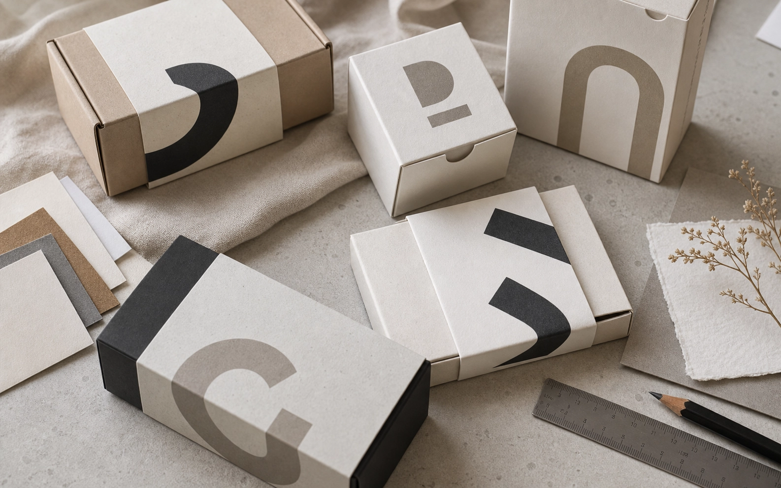
Modern packaging needs type that can carry brand tone while staying readable across small production sizes. How to pair sans serif display and text faces for packaging sleeves, labels, and product inserts.
Production Notes
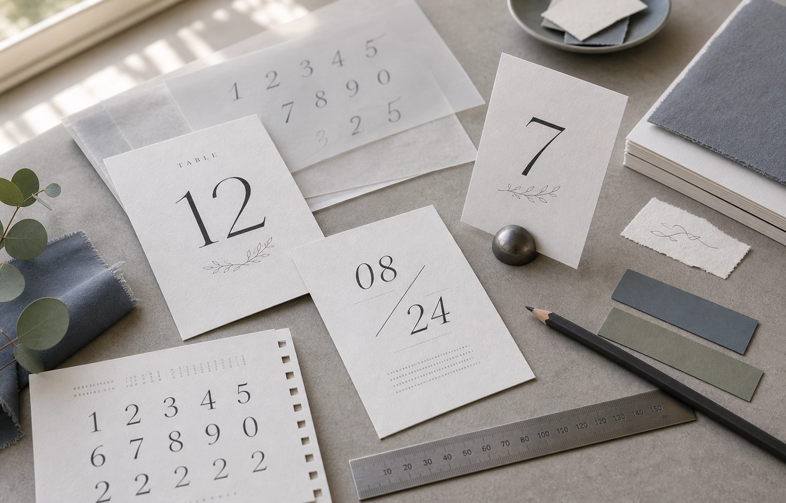
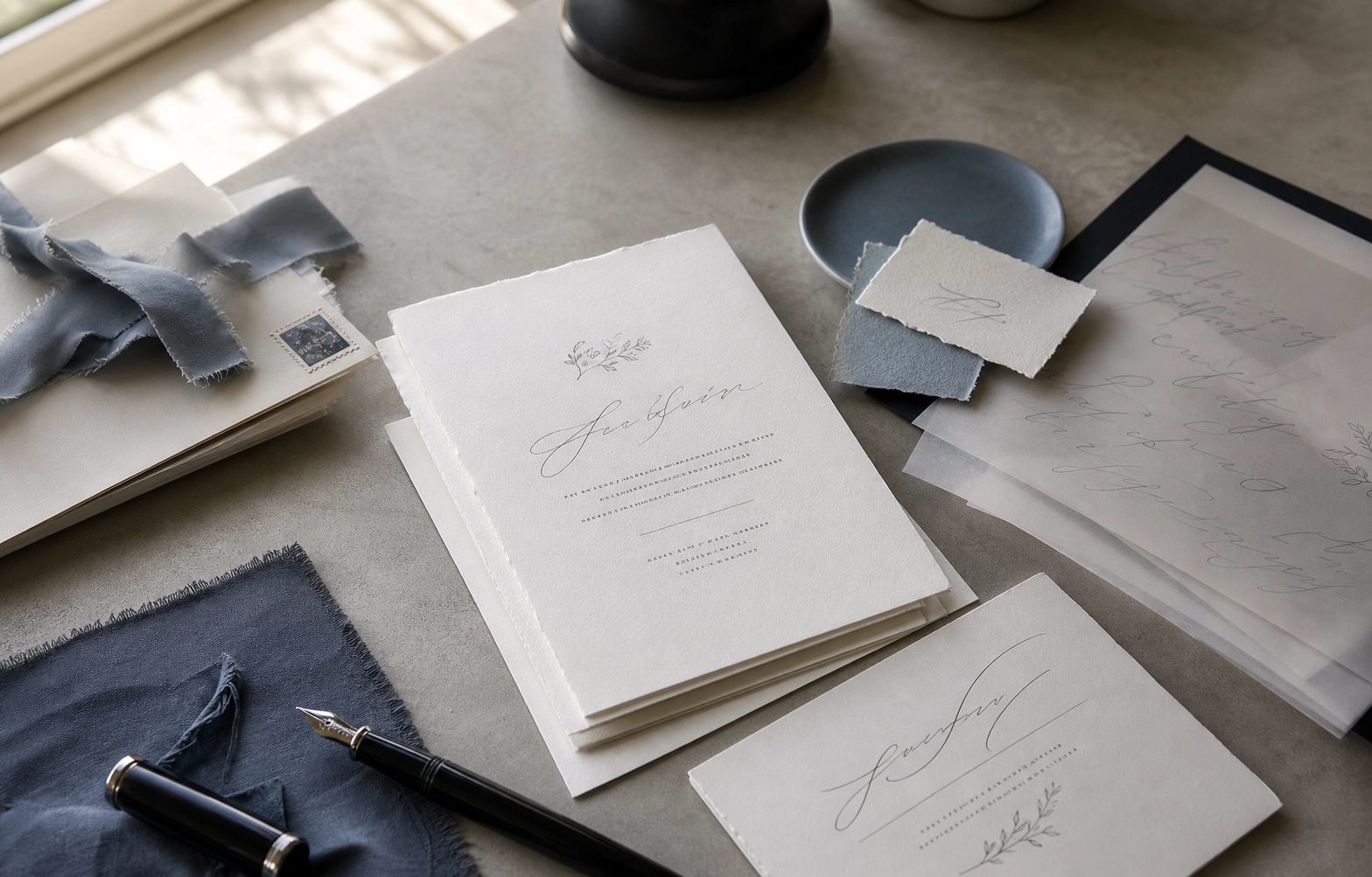
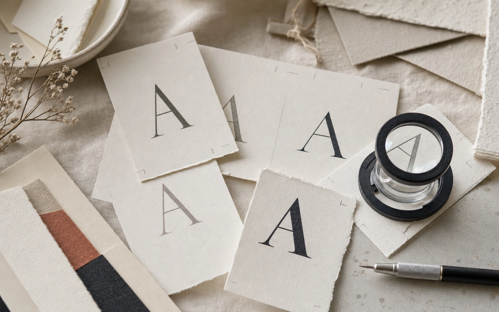
The direction was planned around typography, packaging, sans-serif. We kept the layout practical for production: files stay clean, finish layers are separated, and the visible hierarchy remains calm at real print size.
Details
- display and utility roles
- weight contrast
- ingredient readability
Takeaway
This piece is a useful reference for customers comparing paper, finish, and layout decisions. It shows how a small printed object can feel deliberate when material choice, typography, spacing, and finishing are decided together rather than added at the end.