
June 13, 2026Wedding Stationery
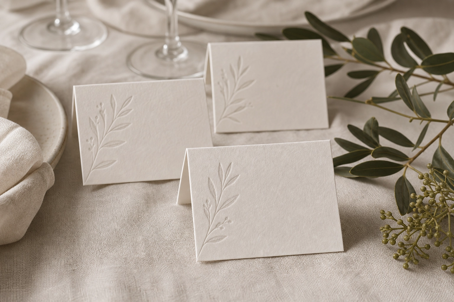
Letterpress Place Cards With Soft Ink
Overview
A practical table piece that needed clear names, consistent folds, and enough texture to feel intentional. Folded place cards printed in a soft ink tone, designed to coordinate with menus and table numbers.
Production Notes
The direction was planned around wedding-stationery, letterpress, place-cards. We kept the layout practical for production: files stay clean, finish layers are separated, and the visible hierarchy remains calm at real print size.
Details
- folded tent format
- soft grey letterpress
- name-list production workflow
Takeaway
This piece is a useful reference for customers comparing paper, finish, and layout decisions. It shows how a small printed object can feel deliberate when material choice, typography, spacing, and finishing are decided together rather than added at the end.