
May 7, 2026Font Notes
Serif Fonts That Print Well at Small Sizes
Overview
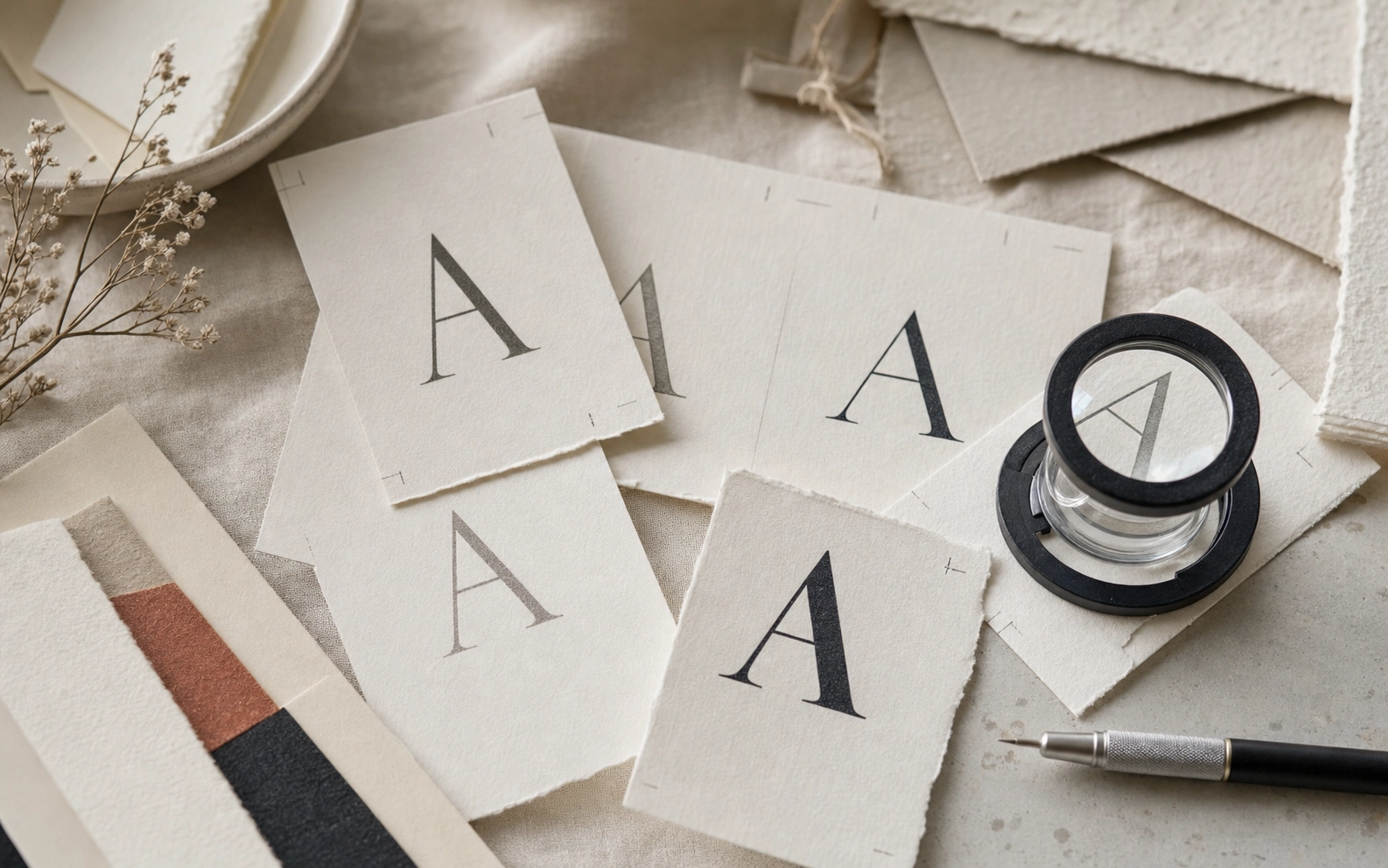
Small serif type can look elegant or fragile depending on contrast, counters, and the final print process. A typography note on choosing serif typefaces that hold detail in letterpress, foil, and digital print.
Production Notes
The direction was planned around typography, serif, readability. We kept the layout practical for production: files stay clean, finish layers are separated, and the visible hierarchy remains calm at real print size.
Details
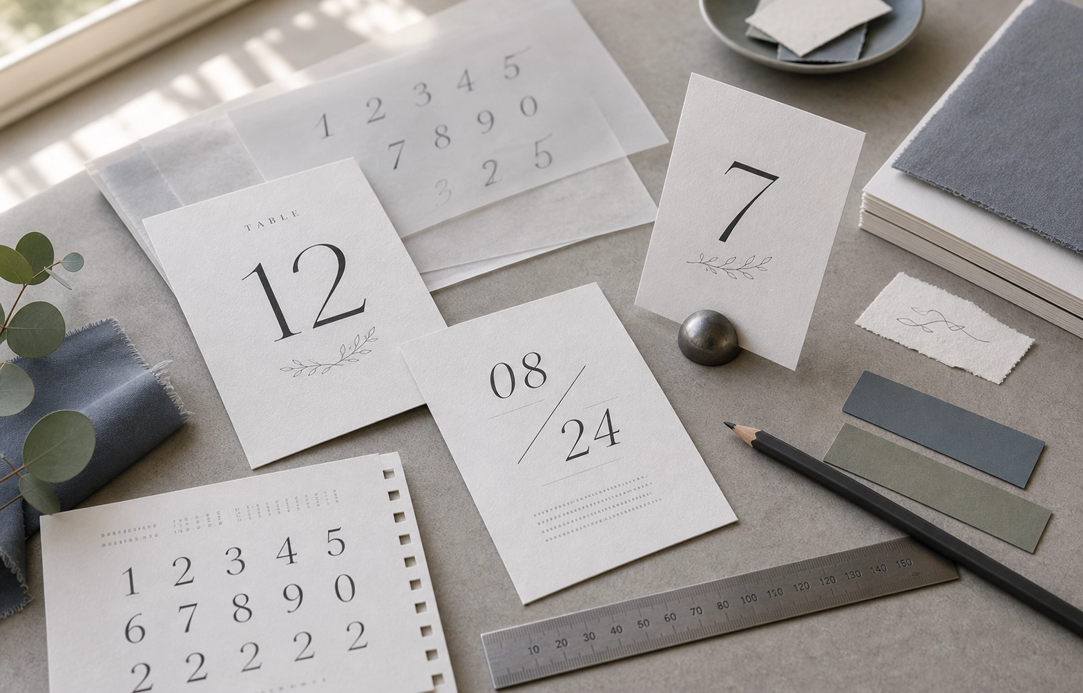
- watch hairline contrast
- test numerals
- avoid overly tight tracking
Takeaway
This piece is a useful reference for customers comparing paper, finish, and layout decisions. It shows how a small printed object can feel deliberate when material choice, typography, spacing, and finishing are decided together rather than added at the end.