
May 9, 2026Case Studies
Case Study: Turning a Logo Into a Letterpress Card
Overview
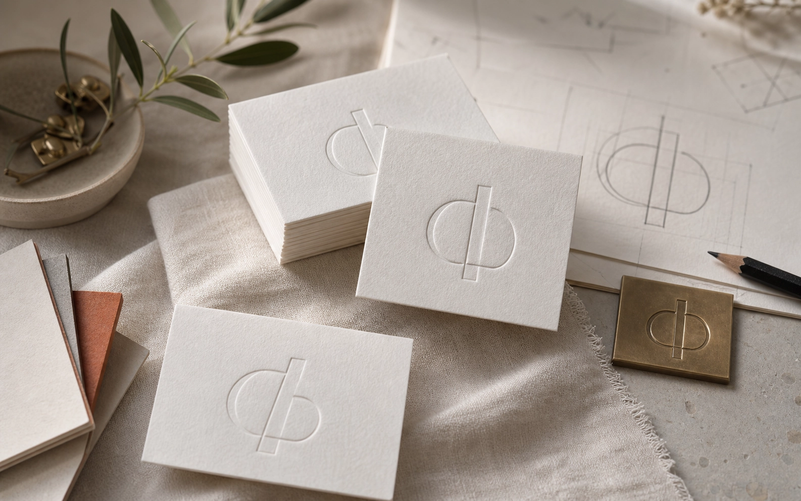
The strongest card direction often comes from removing weak elements before choosing paper or finish. A process note on converting a simple logo file into a balanced letterpress business card layout.
Production Notes
The direction was planned around case-study, business-cards, letterpress. We kept the layout practical for production: files stay clean, finish layers are separated, and the visible hierarchy remains calm at real print size.
Details
- logo cleanup
- contact hierarchy
- impression depth
Takeaway
This piece is a useful reference for customers comparing paper, finish, and layout decisions. It shows how a small printed object can feel deliberate when material choice, typography, spacing, and finishing are decided together rather than added at the end.